Month 9: Your Relationship With Color
Color
Have you ever thought much about color? Why are you drawn to certain colors and why do you avoid other colors?
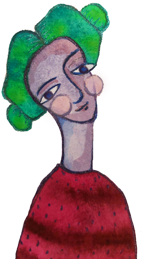
I tend to be drawn to muted colors. To me they feel softer and more welcoming. I can appreciate vibrant bright colors in small doses, but too much feels abrasive to me. Muted colors make me feel more comfortable. When I paint I typically choose shades of greens and blues. I sometimes enjoy adding a pop of a brighter, more vibrant color, such as fuchsia or golden yellow, but again, in small doses. If I walk into a space that is filled with bright colors I tend to feel overwhelmed. It can be a sensory overload for me. But, why is that? Many people love to be in brightly colored spaces. Many people are drawn to the energy of bright colors. What makes our preferences different?
I am fascinated by color psychology. Color Psychology is the study of colors and hues and their affects on human behaviors/moods. This is interesting to me because it seems as if colors have universal significance. For example red is attention grabbing. It has a lot of energy. It is associated with passion be it love or anger. Various cultures may associate slightly different meanings with a particular color. For example in Chinese culture red is equated with good fortune and is often worn for weddings or festivals. Individual people may also have their own interpretation of a specific color. Some people may see red as jolting while others perceive it a endearing. Then when you start to look at the many different shades and tints of each color you start to notice more nuanced associations with that particular hue. For example a brick red gives off a very different mood than a bright cherry red might. Color psychology is utilized all around us from street signs, to hospital rooms, to billboards, but have you ever stopped to think about your own relationship with color? Have you ever thought to use you own color preferences to get a better understanding of yourself?
Exploring Your Personal Color Psychology
What colors are you drawn to?
Do you have a favorite color? Perhaps a color that you notice popping up on repeat in your art or even in your home? That is a great place to start. Explore that color. Research the universal meanings associated with that color. A website I enjoy using is Empowered By Color but there are many out there.
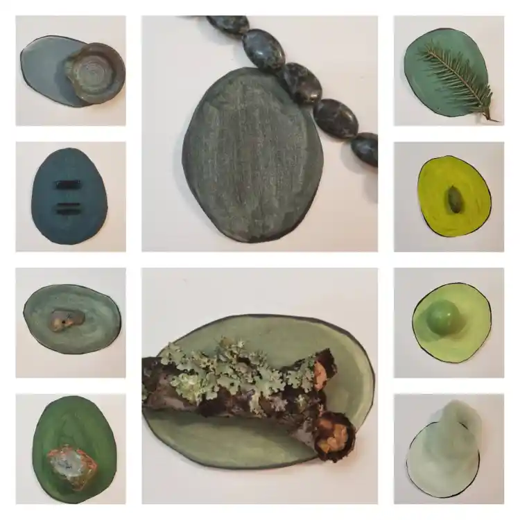
Start to recognize patterns in your color selections. Look through you past art work or even your own closet. What do you notice? For instance I notice that I am drawn to green. When given a choice between colors of an item I will always choose the green one. But, as I look through my recent art I notice that I have been using more blues than greens. I will tell anyone who asks that green is my favorite color, so why have I recently been so drawn to blue? Looking at the meanings behind green vs the meanings behind blue might give me some insight. For example green symbolizes balance and growth while blue is associated with peace and tranquility. Lately I think the shades of blue have been more linked to my mental state because I am seeking tranquility as I go through a period of change in my personal life. The calming presence of blue speaks to that need. Looking at colors in this way can be a great journal prompt!
Month 9 Prompts
Art-Break
Play with color!
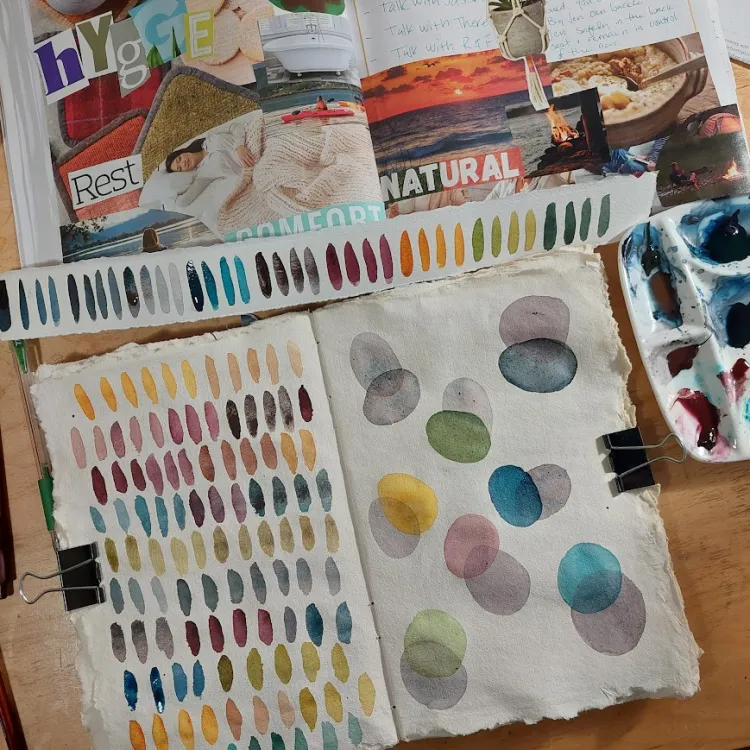
Take yourself on a little scavenger hunt, outside or around you house. Notice what colors you are drawn to and collect a few small items with appealing colors. Now use your watercolor or acrylic paints to create swatches of color as close as possible to your collected items.
Reflection
Research your favorite color. What attributes are attributed to your color? Next think about your least favorite color. What attributes are attributed to it?
Your color mood. If your mood was a color what would it be? Why?
Support your practice this month:
Support Your Art Within Journey
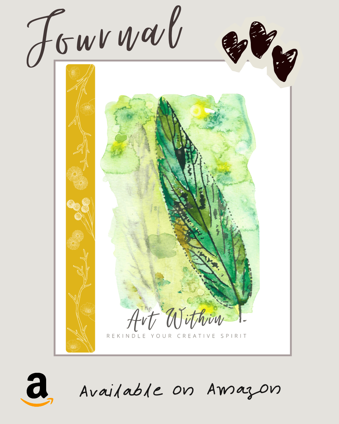
Support your Art Within Journey with the Art Within Journal. It is divided into 12 months that correspond to the 12 Art Within topics. Start at anytime of the year since this journal is not dated! There is plenty of space for visual and written reflections. Purchase your copy on Amazon.
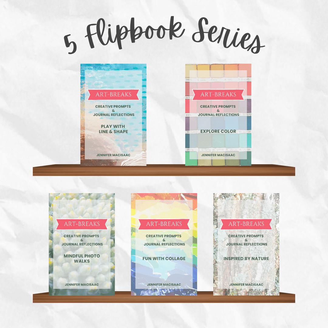
Need more support? Check out my flipbook series. Each book focuses on a different creative topic with both visual prompts and written reflections. They are the perfect complement to you Art Within Journey!
Topics: Line & Shape, Color, Mindful Photo Walks, Collage, and Nature.
Follow my Instagram & my HeART Circle Newsletter
Tips, Prompts, & Special Offerings
“I found I could say things with color and shape that I couldn’t say any other way.”
Georgia O’Keeffe